A Year in Shorts Day 264: "The Old Man and the Sea"
Regular readers of this blog will remember that I have long contested that (with one major exception), the nominees for Best Animated Short at the 72nd Academy Awards is one of the best years in the history of the category. Regular readers will ALSO recall my fondness for the work of Russian animator Aleksandr Petrov, even if I do find some of his films a tad frustrating at times. Well today those throughlines intersect, as we look at Aleksandr Petrov’s The Old Man and the Sea, the animated short which managed to stand above its venerated competition and secure itself a well-deserved Oscar as the best animated short of 1999. Let’s dive in, shall we?
The Old Man and the Sea is, rather obviously, based on the novel by Ernest Hemingway, which I have not read but have been assured by mother is quite good. As far as I can tell, it follows the events of the story pretty closely, give or take a few artistic diversions here and there. Still, this is a Petrov film; the plot is more or less besides the point. It's really more just a vehicle for his unique style of animation. Of all the animation techniques we've looked at throughout our Year in Shorts, paint-on-glass ranks among the most impressive, and is certainly the most uncommon. Just the fact that Petrov's films (even the ones I wasn't a huge fan of) exist at all is worthy of celebration. And by the time The Old Man and the Sea was released, Petrov had clearly become the master of this technique, producing his most fluid film to date. That, combined with a masterful use of light and color, makes for one of the most visually splendid films I've ever had the pleasure of seeing. And luckily it's online for you to watch too!
In the past, I have expressed occasional frustration with Petrov's films. As much I as I love and admire paint-on-glass animation, it has its limitations. Really all forms of animation do; part of the craft is learning to overcome or work within those parameters. The Old Man and the Sea clearly demonstrates that Petrov has done this. While the motion in the animation may still be somewhat limited (especially in regards to the characters), it is far less stiff and awkward compared to some of the earlier shorts. (I'm sure it helps that the titular old man is a fairly stoic figure, but even so, there's clearly a leap forward in quality.) The Old Man and the Sea is Petrov's first film produced outside of Russia, animated in the Pascal Blas Studio in Canada, with financing coming from Russia and Japan. I wonder if the greater amount of resources available to him allowed for Petrov to get more ambitious, including several sequences of full blown action. Petrov also wisely avoids going into too much detail with a lot of the characters' facial expressions, which prevents them from looking too uncanny and probably saved him a great deal of effort. (Considering the only two animators on the film were Petrov ad his son Dimitri, that must have been incredibly important.) The art style of this film has been called Romantic realism, and I'm sure that is pretty accurate. But I think the character animation often has more in common with Impressionism than anything else; we get the sense of what the old man is feeling without having to see it in too much detail.
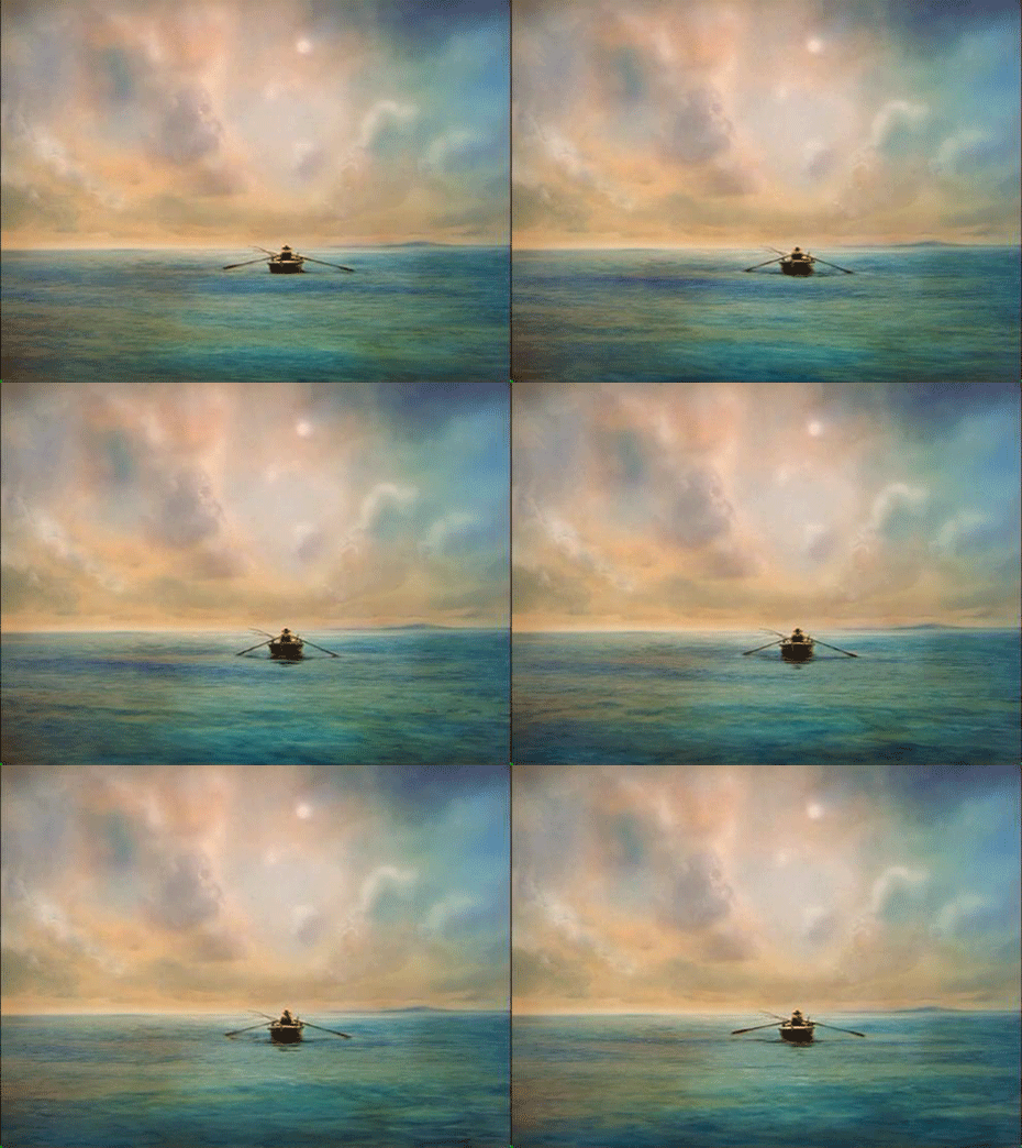
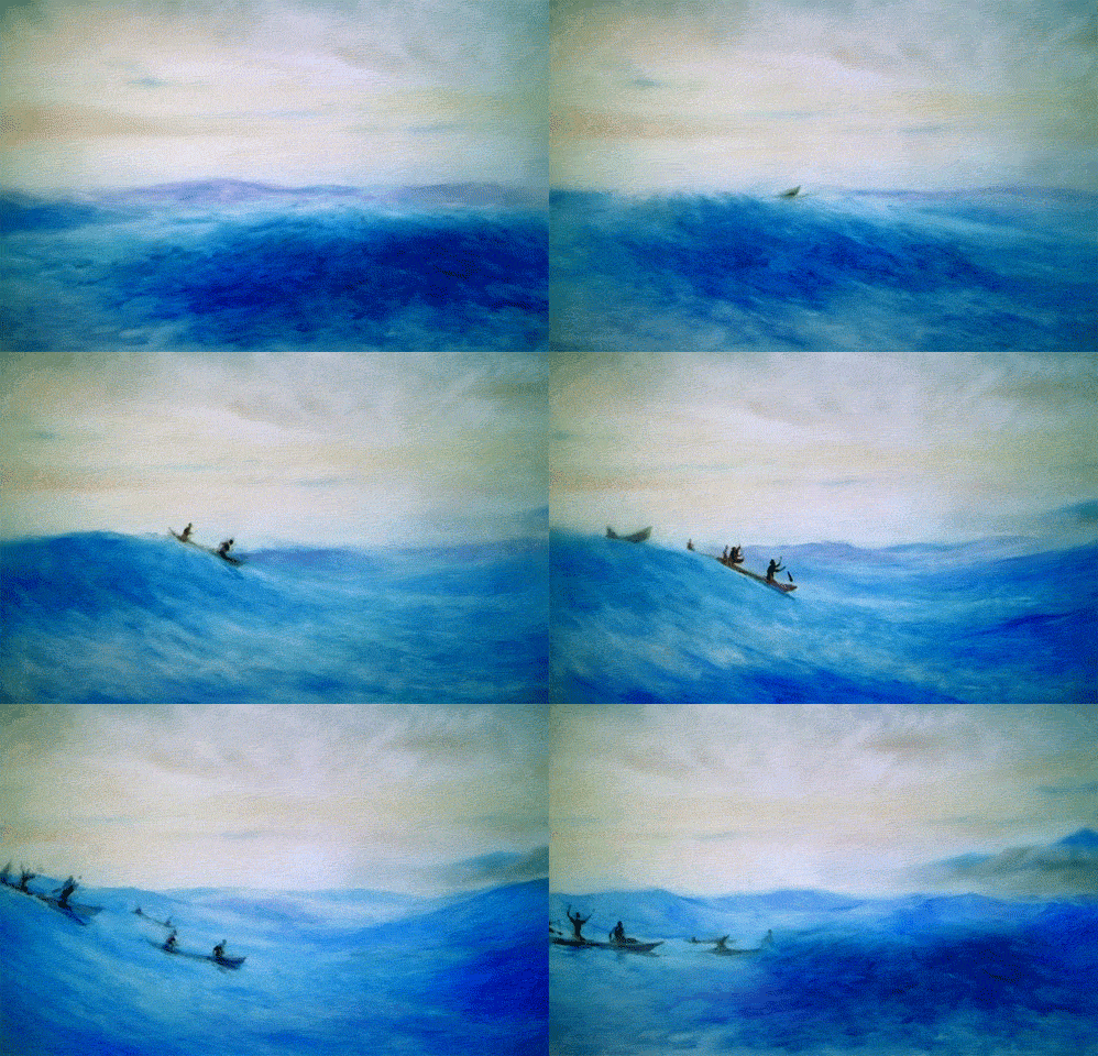
The other big area of improvement for this film, at least from my perspective, is in Petrov's use of color. One of the big critiques I had for The Cow and Mermaid was the fact that they both used pretty dull and muted color palettes. And while this was clearly intentional, it certainly wasn't pleasant to look at. Furthermore, when combined with the inherent limitations of paint-on-glass (and, I will concede, not helped by the low quality prints available to me), often resulted in the films looking rather muddled. Thankfully, The Old Man and the Sea avoids this entirely. It's clear that the ocean is the perfect subject for Petrov, who fills the film with bold and striking shades of blue, green and orange throughout. Not only is this exceedingly beautiful to look at, but the contrast in colors helps keep the action easy to follow. This even extends to the darker sections of the film; it seems very simple, but the way in which Petrov contrasts the dim yellow light from a candle with the black of night is effective for the story and gorgeous to look at. And really, who doesn't love a film that's just full of painted light on water? I can't even begin to comprehend how artists pull that off, and certainly not how anyone pulls it off this well. I could go on and on about the color and lighting in this film, but I'm not sure that I could ever find the words to do it justice. I'm not sure anyone could. Sometimes it's best to just let the visuals speak for themselves.
However, there are elements of this film which I feel slightly more qualified to discuss, and that includes the use of more surreal imagery and dream sequences. I'm not sure how close they are to the book (I've never read Hemingway, so I'm not sure whether or not he was prone to flights of fancy), but they certainly do keep things fresh here. They're also well-suited to this style of animation, which is perfect for blurring the lines between fantasy and reality. At times it reminds me of The Man Who Planted Trees, especially with some of the transitions, even if it's not quite to that level. (To be fair, very few films even approach that level.) And while I haven't read the book, these sequences certainly give me the impression that I'm reading a book at any rate. The act of reading has a strange, dream like quality to it, which I feel like most film adaptations of novels don't really capitalize on. Few even really try. But when they succeed, like with The Man Who Planted Trees or The Age of Innocence, it's something truly magical. And "magical" describes this film more or less perfectly.
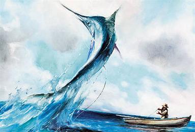
After all, is there any kind of film more magical than one set in the ocean? (Well, a good one anyway. The less said about Shark Tale the better.) Perhaps it's just my nostalgia for my childhood dreams of being a marine biologist or just my continued love for aquariums, but any film that takes the time to just showcase ocean life is a-OK in my book. The film is packed with little moments of fish or birds just living their best lives, and it's honestly something I could watch all day. It certainly doesn't hurt that water is something for which I think paint-on-glass animation is particularly well-suited. The technique (which often involves the use of the animator's fingertips as well as brushes) often results in slight ripples in the image anyway, so when animating something with ripples it works especially well. Some forms of animation can struggle with water (as anyone who's ever watched a Rankin-Bass character cry can attest to), but Petrov seems tailor made for it. From the more obvious sequences of a boat floating across the water or the marlin breaching the surface, to the smaller moments like the oar paddling through the ocean, I'm not sure the sea has ever looked quite this good.
Any complaints I could make about this film would be exceedingly minor. There are a handful of moments when the character animation still looks a bit off, but at some point you're just nitpicking. And I have some small quibbles with the storytelling, mostly with the ending, which feels a little rushed. But that's probably more to do with the story compression than anything, and like I said, the story really is secondary with this short. There was some exceedingly fierce competition for Best Animated Short at the 72nd Academy Awards, but The Old Man and the Sea more than deserves its win. While Humdrum was incredibly clever, When the Day Breaks was thought-provoking and My Grandmother Ironed the King's Shirts was as charming as a short gets, The Old Man and the Sea is undeniably the most impressive artistic achievement of the nominees. It showcases a bold and unique artist at the height of his abilities, having at last found a story and setting which perfectly complements his considerable skill. And besides, while those other three shorts may have lost the Oscar, they can all at least say one thing- they're a hell of a lot better than the FINAL nominee from that year, 3 Misses. But we'll be covering that short in October. Trust me, you'll need that much time to prepare for it.
Keep up with the Oscar Baiting here on Letterboxd!
The Great Oscar Baiter is a not-for-profit work of criticism. All images herein are property of their respective owners and are protected under Fair Use.


Comments
Post a Comment